
articles/Paper/barytaroundup-page4
Paper Chase Baryta Roundup - part 4 of 1 2 3 4
by Mike McNamee Published 01/10/2013

Choosing
So how do you choose? Well the barytas are generally at the premium end of the price range and for many this limits them to exhibition prints and high-end sales - even we do not use barytas for proofing despite having boxes of samples to hand! The great accuracy is a help across the board including more certainty in the rather uncertain area of screen-to-print matching. It will help if reproduction accuracy across the gamut is vital. But what if your picture is predominantly blues? Herein lies the thorny issue of matching the paper surface to the image. A generally cool image will display more vibrance with a cool paper, at the expense of the yellows. A cool paper will degrade the yellows as the blueness of the base pollutes them, so a beach scene with yellow sand and blue skies presents a problem. Sand or sky has to be either sacrificed or artificially boosted in image processing. This is why you need to be alert to falling for the charms of a particular paper because of a colleague's image that presents well on it - your image, with a different colour emphasis might look a little disappointing. For exhibition work it is important to match the base tone of the window mount to the paper, a very bright/cool paper will look ghastly set in a cream or off-white window.

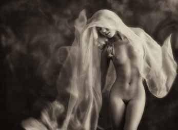
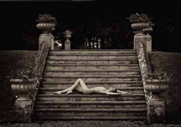
All baryta papers are favoured by monochrome workers. Here the choice is slightly easier. If your mono image's base tone is warmed then the image should be set on a warm to neutral paper. If you are after a cooler look then a cooled paper will assist, along with some cooling in the advanced black and white driver. A more senior portrait might look best, and most sympathetic, on a warm combination; a modern portrait or fashion shot might look best cool. By way of example, within our membership, this might be best illustrated by comparing the nude work of the Yerbury's and Damian McGillicuddy. Faye and Trevor produce very classical figure studies which lend themselves to their favoured Fotospeed Platinum Warmtone and are often warmed in image processing; Damian's more 'raunchy' style is usually cooled by the photographer himself and would naturally lend itself to a brighter and cooler paper. This comparison gives me the opportunity to reshow my favourite images from these maestros - a fitting place to finish!
- Paper Chase Baryta Roundup page 1
- Paper Chase Baryta Roundup page 2
- Paper Chase Baryta Roundup page 3
- Paper Chase Baryta Roundup page 4
1st Published 01/10/2013
last update 20/07/2022 13:53:41
There are 0 days to get ready for The Society of Photographers Convention and Trade Show at The Novotel London West, Hammersmith ...
which starts on Wednesday 14th January 2026


