
articles/Fashion/rollingwiththebigdog12-page3
Rolling with the BIG Dog Part 12 - part 3 of 1 2 3 4
by Damian McGillicuddy Published 01/10/2011

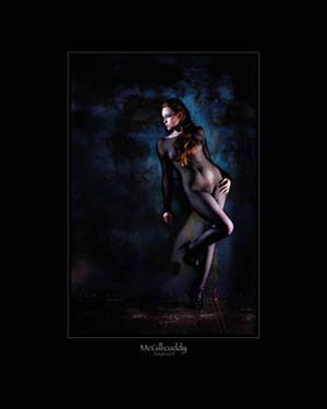
Ok, let's jump to an image that is almost diametrically opposed to the first. Not only is the image slightly darker in narrative but I've add a third light. Not only have I added the extra light but the quality of light is radically different from our opening image.
How was it done?
Location:
The McGillicuddy camera room
Subject:
Charlie Edwards
What was in the bag:
Nikon D3 fitted with Nikkor 24-70mm f2.8
3x Elinchrom ranger quadra, 2 fitted with 18cm dishes and grids
Elinchrom Universal Skyport
Sekonic L-758D light meter
Camera settings:
Image captured in RAW
ISO 200, f4 @ 1/200 sec
Lens set at approx. 60mm
RAW file processed through Aperture 3.1
So what did I do and why did I do it:
The concept for this image was to heighten the sensuality inherent in the image and give a sense of 'lady of the night' entwined in the narrative.
With the intent in mind it gives us a strong lead to follow which helps us through the process of designing the image. The lower key approach, the harsh metallic background, the very sexy outfit and the 'hanging around for business' edge to the pose all add to and compliment one another within the intent to strengthen the overall impact of the image, thus supporting the concept and story of the image.
Lighting-wise to fit in with the already stated narrative, I saw the light being crisp to harsh with minimal highlight to shadow transition. Constricted pools of light to highlight the areas I deem necessary to sell the story, with deep sharp shadows.
In essence there are (almost) two 'key' lights in this image! The first is an 18cm dish fitted with a tight grid to restrict the spread of the light positioned high to camera-left. This light was feathered just to catch the mask of the subjects face but not to spill on to the steel background.
The second light was positioned to camera-right and much lower than the previous image. The grid fitted to the 18cm reflector gave a slightly wider spill of light than that of the first light illuminating and highlighting the subjects, legs, pelvic area and hips. Again the edge of the light is used to illuminate and is carefully 'feathered' into the appropriate areas and just as importantly held away from the areas I don't want to draw attention to...it was EV +0.75 to the 'key', in other words ever so slightly brighter ;0)
The third light I brought to this party was another Quadra. This time we left the standard reflector head on. It was positioned just off to my side, at the shooting position. This light is used as a 'fill' so I could control the level of density in the shadows in my photograph; it was set at approximately EV -2. Understanding lighting ratios in a practical sense is one of the things I'm keen on teaching in the appropriate workshop...ratio in your lighting is key critical...period!
The languid sexuality of the model's pose was meant to portray a jaded indifference of her 'profession' but the coquettishness of the leg and thrust of the hips an attempt to show that the 'stall' is still set out and she is 'open' for business...if you're buying!
As you can see every facet of the image is considered and manipulated to support the narrative and intent of the study, all going to add its own little part to the overall drama of the piece. Job done!
What about post:
As usual all blemishes were retouched away, stray hairs tamed and the compulsory 'gloss over' with Aperture 3's skin softening brush (this saves me soooo much time).
Then there was a tweak of vibrancy added and a boost to the blues, again done in Aperture 3.... Less is very often more?
- Rolling with the BIG Dog Part 12 page 1
- Rolling with the BIG Dog Part 12 page 2
- Rolling with the BIG Dog Part 12 page 3
- Rolling with the BIG Dog Part 12 page 4
1st Published 01/10/2011
last update 20/07/2022 13:53:43
There are 0 days to get ready for The Society of Photographers Convention and Trade Show at The Novotel London West, Hammersmith ...
which starts on Wednesday 14th January 2026


