
articles/Portraiture/stevesuprise-page1
Rolling with the BIG Dog -Steve's Surprise - part 1 of 1
by Damian McGillicuddy Published 01/08/2013

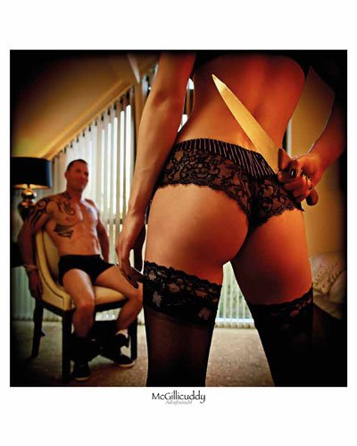
As I've previously said To keep my own grey cells working I set myself challenges. This image came from one such self-imposed test. I had a night of time to 'kill ' before the recent Whitby goth weekend shoot so I thought it was a great time to set myself a test.
I decided that I'd try to create a narrative rich image with minimum kit, a super pared down strobist shoot if you will. It was obvious to therefore shoot a beautiful lingerie-clad girl and convince my long suffering assistant to strip off and allow me to tie him to a chair. The concept being that he was about to receive something ... but not what he was expecting!
Choosing the 12mm f2 as my shooting lens I'd have to compose my image carefully so I didn't distort, my subjects in a negative way - so that's my first test! Just to make it a little harder I thought I'd see what I could conjure up with just two barefaced speedlights ... no modifiers today... eeeeeek - goodbye comfort zone!
Actually its not as bad as it sounds, it just means I have to think a little more. In truth that's the whole point of the exercise - to make one think and overcome the apparent challenges that pop up in the creative process.
You can't see from the behind the scenes sketch that the room had vaulted cathedral ceilings ... in my world great surfaces to bounce flash off. I can control the spread and contrast of the light by both 'zooming ' the flash head and the proximity of the flash to the wall. If you think about it logically the size of the pool of light you reflect is a little like choosing the size of your soft-box ... bigger the light the less the contrast, it really is that simple.
My light to camera-right was fitted with a full-cut CTO (colour temperature orange) and bounced off the join between the wall and the roof. It was set on a wide zoom to spread the light in a wide wash over the room, mimicking the warmth of that cast by architectural room light - in other words a bedside lamp!
As it is positioned closer to my 'lady of the knife ' she benefits from a warmer glow than does her victim ... the inverse square law really is our friend ;0)
It is imperative to me that as well as thinking of the narrative in my imagery I give the light an element of reality and believability as well as a sculptural depth. My second speedlight was secreted to camera left. I'm standing at the top of the stairs to get the composition I desired. Again looking at the sketch you can see that the wall to the left dips backward into a little alcove before heading to the window I was using as my background.
This was great as in effect it gave be a 90 degree corner to bounce my light into and thus control the angle of its return allowing me to highlight my female subject and add additional shape and form...
completing my three dimensional lie in a two dimensional medium.
The last light in my image is hidden in plain view!
The window light was used to give an accent on Steve, highlighting his ample musculature but also giving a little fill and raising the shadow depth in other areas of my image.
To blend the existing ambient light with the supplemental flash light in the manor most suitable for my image meant 'dragging' the shutter. In other words, allowing the shutter to be open long enough for the lower level of ambient light to record in the image. The flash in essence being controlled by the aperture setting/power output combo.
Shot at 1/50th of a second at f2.2 at 200 ISO ...
styling-wise the art filter 'pin hole ' lends its creative weight to the image, job done, another ad image for Olympus, watch out for it in print.
Stripped down kit, thought about, manipulated and used effectively in the image, proving that sometimes less can indeed be more ;0)
'till next time
McGillicuddy
1st Published 01/08/2013
last update 20/07/2022 13:53:43
There are 0 days to get ready for The Society of Photographers Convention and Trade Show at The Novotel London West, Hammersmith ...
which starts on Wednesday 14th January 2026


